Understanding ITCSS: Real case using ITCSS - https://carloscaballero.io
• • 16 min readCSS is a painful
CSS is a painful when not written properly and sadly the majority of times CSS is incorrectly organized. The main problems when you use CSS are the following ones:
- Global scope. All rules in CSS are in the same scope, so that you can overwrite rules when you use different style sheets.
- Cascading rules. The source order really matters when you have a global scope.
- Inheritance. The rules can inheritance between their and you can expect a different behavior due to this characteristic.
- Selector specificity. One of the biggest problems when creating style sheets comes from the fact that the operation of selectors is not known in depth.
These problems are recurring on large projects due to there are a large number of people working without a framework or work rules. Sadly, the result of this circumstance is that the stylesheets to be chaotic.
Therefore, the solution is writing CSS in specificity order and that order is provided by ITCSS.
ITCSS (Inverted Triangle CSS)
ITCSS is an architecture especially suited for large projects created by Harry Roberts. It is neither a library nor a design framework (Bootstrap, Angular Material), but a way to structure the elements of stylesheets. This architecture doesn't depend on pre-processors (SASS, Stylus or LESS) but it is highly recommended to use them to obtain a greater benefit from the use of this architecture.
In simple words, ITCSS is a methodology for organizing CSS files within layers-from generic to explicit, and from low to high specificity.
In the following image you can see the inverted triangle:

The layers of the triangle are the follows:
- Settings – used with preprocessors and contain font, colors definitions, etc. In this layer is common define the variables that can customize the template.
- Tools – globally used mixins and functions. This layer is only used if we use a preprocessor as SASS.
- Generic – reset and/or normalize styles, box-sizing definition, etc. It is important to note that this is the first layer of the triangle that generates CSS.
- Elements – styling for bare HTML elements (like H1, A, header, footer, ...). These come with default styling from the browser so we must to redefine them here.
- Objects – class-based selectors which define undecorated design patterns, for example media object known from OOCSS such as list, radio-button. The Daniel Fornell's codepen https://codepen.io/collection/DmzVOM/ shows you a list of objects designed using this architecture.
- Components – specific UI components. The components of our page, for example button, card, concrete-list, etc..
- Utilities – utilities and helper classes with ability to override anything which goes before in the triangle.
Real example - This blog!
The best way to understand a new technique or architecture is with an example. So, I'll show you how I designed the theme of this blog using this architecture.
This blog is developed using the powerful GhostCMS tool which allows us to make our own templates using handlebars in conjunction with CSS. However, to generate the CSS of this topic I have decided to use the ITCSS architecture using SASS which will transpile the code to a final style sheet in CSS that will give the visual aspect of this theme.
Therefore, the first thing we have to see is the directory structure of this project, as shown in the following image.
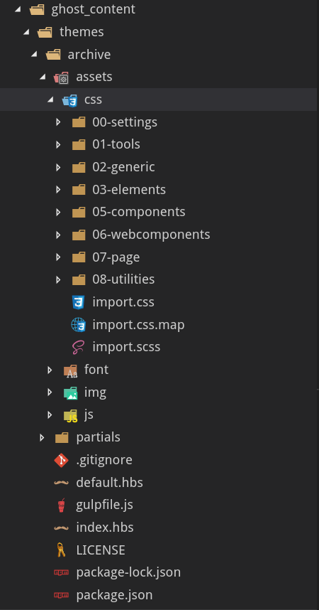
In this structure you can observe the following parts:
- partials: Where are the handlebar files where the different parts of a blog page are structured, such as footer, header, pagination, postlists, sidebar.
- assets: Where we find the following subfolders:
- css: This is where we structure our style sheets using ITCSS.
- font: Different fonts.
- img: Images.
- js: Required JavaScript libraries such as highlight.js.
- /: In the root directory we find the handlebar files corresponding to the index, post, tag and default and some configuration files such as package.json or gulpfile.
Next, we will describe the .scss files of each of the ITCSS layers in order to be able to see what has been included in each of the layers.
Settings
The content of settings.scss file is as follows:
@font-face {
    font-family: 'Source Sans Pro';
    src: url(../../font/Source_Sans_Pro/SourceSansPro-Regular.ttf);
}

@font-face {
    font-family: 'Ailerons';
    src: url(../../font/Ailerons-Regular.ttf);
}

@font-face {
    font-family: 'Fira Mono';
    src: url(../../font/Fira_Mono/FiraMono-Regular.ttf);
}

$colorPrimary: #ff9617;
$colorSecondary: #4078c0;
$colorFontsDark: #2c2c2c;
$colorFontsMedium: rgba(38, 41, 58, .6);
$colorFontsLight: #fafafa;
$colorLight: #f6f9fa;
$colorMedium: #201f2d;
$colorDark: #26293a;
$colorShadow: rgba(0, 0, 0, 0.4);
$colorSeparateMedium: rgba(250, 250, 250, 0.6);
$colorSeparateDark: rgba(0, 0, 0, 0.2);
$colorListMedium: rgba(38, 41, 58, 0.04);

$fontType: 'Source Sans Pro',
sans-serif;
$fontTypeTitle: 'Ailerons',
sans-serif;
$fontTypeCode: 'Fira Mono',
monospace;

$pcFormatBig: 1920px;
$pcFormatStandard: 1770px;
$pcFormatUltraHD: 1443px;
$pcFormatHabitual: 1366px;
$pcFormatHD: 1190px;
$pcFormatSmall: 1135px;
$mobileFormatBig: 860px;
$mobileFormatStandard: 640px;
You can see that what this file does is to define the fonts to be used and the color palette that will be used throughout the theme. In this file we mainly have the definition of all the variables that we want to be able to customize later.
Tools
The content of tools.scss file is as follows:
@mixin box-size($width:100%, $height:100%) {
  width: $width;
  height: $height;
}

@mixin flex($direction:row, $break:nowrap, $alignWidth:center, $alignHeight:center) {
  display: flex;
  flex-flow: $direction $break;
  justify-content: $alignWidth;
  align-items: $alignHeight;
}
In this layer we still do not produce CSS but we are defining tools (functions) that will facilitate repetitive tasks in higher layers. At this level we have defined two functions:
- box-size. That allows us to define the size of the boxes using two parameters.
- flex. This mixin configures the Flex-Layout rules for the different containers.
Generic
The content of generic.scss file is as follows:
* {
  box-sizing: border-box;
  margin: 0;
  padding: 0;
  font-family: $fontType;
}

div[id='disqus_thread'] {
  width: 100%;
  max-width: 100%;
}
The generic file is quite simple since it only contains a rule that allows us to change the margins and paddings of all the elements of the page, as well as to configure the default typography.
In addition, a rule related to the comment style of the disqus comment service is included in this section. You can see that for the plugin to work properly it is necessary to assign an identifier (id = 'disqus_thread') to the container, but this would totally break the ITCSS architecture. For this, a technique has been used to decrease the specificity of that element up to the attribute level (using the selector of attributes).
Elements
The content of elements.scss file is as follows:
body,
html {
  @include box-size(100%, auto);
  @include flex(row, wrap, center, flex-start);
  background-color: $colorDark;
  scroll-behavior: smooth;

  &::-webkit-scrollbar-track {
    background-color: $colorLight;
  }

  &::-webkit-scrollbar {
    width: 10px;
  }

  &::-webkit-scrollbar-thumb {
    background-image: linear-gradient(135deg, $colorPrimary 5%, $colorLight 100%);
  }
}
In this layer we configure the styles related to the html and body elements.
Generics
the content of generics.scss file is as follows:
body,
html {
  @include box-size();
  @include flex(row, wrap, center, flex-start);
  background-color: $colorDark;
  scroll-behavior: smooth;
  overflow-y: hidden;
}

header {
  @include box-size(100%, 60px);
  @include flex();
  background-color: $colorDark;
}

hgroup {
  @include box-size(0, 100%);
  @include flex(row, nowrap, flex-start, center);
}

nav {
  @include box-size(80%, 100%);
  @include flex(row, nowrap, flex-end, center);
}

aside {
  @include box-size(15%, 100%);
  padding: 1rem;
  background-color: $colorDark;
}

main {
  @include box-size(85%, 100%);
  @include flex(row, wrap, center, flex-start);
  background-color: $colorLight;
  border-radius: 50px 0px 0px 0px;
  box-shadow: inset 10px 5px 30px -5px $colorShadow;
  overflow-y: scroll;

  &::-webkit-scrollbar-track {
    background-color: $colorLight;
  }

  &::-webkit-scrollbar {
    width: 10px;
  }

  &::-webkit-scrollbar-thumb {
    background-image: linear-gradient(
      135deg,
      $colorPrimary 5%,
      $colorLight 100%
    );
  }
}

footer {
  @include box-size(100%, 60px);
  @include flex();
  background-color: $colorDark;
}

@media only screen and (max-width: $pcFormatUltraHD) {
  aside {
    @include box-size(20%, auto);
  }

  main {
    @include box-size(80%, 100%);
  }
}

@media only screen and (max-width: $pcFormatHD) {
  aside {
    @include box-size(25%, auto);
  }

  main {
    @include box-size(75%, 100%);
  }
}

@media only screen and (max-width: $pcFormatSmall) {
  hgroup {
    width: 20%;
  }

  aside {
    @include box-size(300px, auto);
    position: absolute;
    z-index: 2;
    border-radius: 0 0 20px 0;
    transition: left 0.8s ease;
  }

  main {
    @include box-size(100%, 100%);
  }

  img {
    max-width: 400px;
  }

  code {
    padding: 0.5rem;
  }
}

@media only screen and (max-width: $mobileFormatBig) {
  footer {
    height: 100px !important;
    flex-flow: column nowrap !important;
  }
}

@media only screen and (max-width: $mobileFormatStandard) {
  html,
  body {
    height: auto;
    overflow-y: initial;
  }

  hgroup {
    @include box-size(10%, 100%);
  }

  nav {
    @include box-size(90%, 100%);
    @include flex(row, nowrap, center, center);
  }

  main {
    box-shadow: none !important;
    overflow: hidden;
  }

  h2 {
    font-size: 1.5em;

    code {
      font-size: 1.5em;
    }
  }

  figure img,
  img {
    max-width: 90%;
  }

  p {
    overflow-x: scroll;
  }

  h2 {
    font-size: 1.7em;
  }

  ul,
  ol {
    overflow-x: scroll;
  }

  code {
    padding: 1rem 0.5rem 1rem 0.5rem;
    overflow-x: scroll;
    font-size: 0.8em;
  }
}
In this layer, the general rules that affect the HTML elements must be structured. Note that there is no class defined but only use of html elements, pseudo-classes and pseudo-elements. In this layer we have used the power of SASS to nest CSS rules and not have such a verbose code. In fact, if we were to see the specificity graph, there would appear peaks that are related to the nesting levels that we are generating, which is normal.
Objects
The content of objects.scss file is as follows:
/** EMPTY **/
At this time of the design of our template we do not have any rule associated with objects since the rules have been divided into elements when they have been very low level and components when they have gained enough semantic value. Therefore, right now we do not have any rules in this section but it is not bad to have it defined since in constant refactorings and improvements of our architecture we can make use of this layer.
Components
The content of components.scss file is as follows:
.sidebar-logotype {
  display: none;
  @include box-size(100%, 80px);
  margin-bottom: 3rem;
  user-select: none;

  .logotype-link {
    @include box-size(100%, 100%);
    display: block;
    font-size: 2em;
    text-align: center;
    color: $colorFontsLight;
    text-decoration: none;
    text-transform: uppercase;
    font-family: $fontTypeTitle, sans-serif;
    transition: color 0.4s ease;

    &:hover {
      color: $colorPrimary;
    }
  }
}

.header-logotype {
  @include box-size(auto, 60px);
  transform: translate(-2vw, 0);
  user-select: none;

  .logotype-link {
    @include box-size(100%, 100%);
    display: block;
    font-size: 1.5em;
    line-height: 60px;
    color: $colorFontsLight;
    text-decoration: none;
    text-transform: uppercase;
    font-family: $fontTypeTitle, sans-serif;
    transition: color 0.4s ease;

    &:hover {
      color: $colorPrimary;
    }
  }
}

.profile {
  @include box-size(100px, 100px);
  background-repeat: no-repeat;
  background-position: center center;
  background-size: contain;
  text-align: center;
  border-radius: 100%;
  margin: 0 auto 1rem auto;
}

.motto {
  @include box-size(100%, 20px);
  color: $colorFontsLight;
  text-align: center;
  font-size: 0.7vw;
  text-transform: uppercase;
  opacity: 0.6s;
  margin-bottom: 1rem;
}

.social-media {
  @include box-size(100%, 30px);
  @include flex(row, nowrap, space-evenly, center);
  margin-bottom: 2rem;

  .media-link {
    text-decoration: none;
    color: $colorFontsLight;
    font-size: 1.2em;
    transition: color 0.4s ease;

    &:hover {
      color: $colorPrimary;
    }
  }
}

.series-posts {
  @include box-size(100%, auto);
  border-radius: 5px;
  padding: 1rem;
  background-color: $colorMedium;
  overflow-y: scroll;
  box-shadow: inset 0 0 30px -10px $colorShadow;

  &::-webkit-scrollbar-track {
    background-color: transparent;
  }

  &::-webkit-scrollbar {
    width: 5px;
  }

  &::-webkit-scrollbar-thumb {
    background-color: $colorLight;
    border-radius: 10px;
  }

  .news-title {
    @include box-size(100%, 60px);
    font-size: 1.2em;
    color: $colorFontsLight;
    text-transform: uppercase;
  }

  .news-link {
    @include box-size(100%, auto);
    @include flex(row, wrap, center, center);
    border-bottom: solid 0.4px $colorSeparateMedium;
    padding: 0.5em 0 0.5rem 0;

    .news-name {
      display: block;
      @include box-size(100%, 50%);
      font-size: 1em;
      color: $colorFontsLight;
      text-decoration: none;
      transition: color 0.4s ease;

      &:hover {
        color: $colorPrimary;
      }
    }
  }
}

.menu {
  @include box-size();
  @include flex(row, nowrap, flex-end, center);
  padding-right: 1rem;
  list-style: none;
  user-select: none;
  overflow: hidden;

  .menu-item-wrapper .menu-item {
    text-decoration: none;
    font-size: 0.9em;
    color: $colorLight;
    margin: 0 1rem;
    text-transform: uppercase;
    transition: color 0.4s ease;

    &:hover {
      color: $colorPrimary;
    }
  }
}

.card {
  position: relative;
  @include box-size(450px, 300px);
  @include flex(row, wrap, center, center);
  margin: 0 0 3rem 0;
  border-radius: 5px;
  background: #ffffff;
  box-shadow: 0 0 10px -2px $colorShadow;
  transition: box-shadow 0.4s ease;

  .card-banner {
    @include box-size(100%, 50%);
    border-radius: 5px 5px 0px 0px;
    clip-path: polygon(
      70% 100%,
      0 100%,
      0 0,
      100% 0,
      100% 100%,
      80% 100%,
      75% 90%
    );
    box-shadow: inset 0 -10px 30px -15px $colorShadow;
    background-repeat: no-repeat;
    background-position: center center;
    background-size: 100%;
    transition: all 0.4s ease;
  }

  .card-glass {
    position: absolute;
    display: block;
    @include box-size();
  }

  .card-information {
    @include box-size(100%, 20%);
    @include flex(row, nowrap, flex-end, center);
    padding-right: 2rem;

    .card-readme-time,
    .card-separate,
    .card-date {
      margin: 0 0.5rem;
      font-size: 1em;
      color: $colorFontsMedium;
    }

    .tags-list {
      margin: 0 0.5rem;

      .tag {
        @include box-size(20px, 20px);
      }
    }
  }

  .card-title {
    @include box-size(100%, 30%);
    border-radius: 0px 0px 5px 5px;
    padding: 0rem 2rem 1rem 2rem;
    font-size: 1.2em;
    font-weight: bold;
    text-align: center;
    color: $colorFontsDark;
    transition: all 0.4s ease;
    overflow: hidden;
  }

  &:hover {
    box-shadow: 5px 5px 30px -5px $colorShadow;
  }

  &:hover .card-title {
    color: $colorPrimary;
  }
}

.pagination {
  @include box-size(100%, 100px);
  @include flex(row, wrap, center, center);
  padding: 0 3.5rem 2rem 3.5rem;

  .pagination-page-number {
    @include box-size(100%, 40%);
    text-align: center;
    line-height: 24px;
    font-size: 1.2em;
    color: $colorFontsDark;
    margin-bottom: 1rem;
  }

  .pagination-page-button {
    @include box-size(100%, 60%);
    text-align: center;

    .link {
      display: block;
      @include box-size();
      border: solid 1px $colorDark;
      border-radius: 5px;
      text-decoration: none;
      line-height: 36px;
      color: $colorDark;
      transition: all 0.4s ease;

      &:hover {
        border: solid 1px $colorPrimary;
        color: $colorPrimary;
      }
    }
  }
}

.footer-user {
  @include box-size(50%, 100%);
  @include flex();

  .copyright {
    font-size: 0.9em;
    text-transform: uppercase;
    color: $colorFontsLight;
    opacity: 0.6;
  }
}

.footer-ghost {
  @include box-size(50%, 100%);
  @include flex();

  .information {
    font-size: 0.9em;
    text-transform: uppercase;
    color: $colorFontsLight;
    opacity: 0.6;
  }

  .author {
    color: $colorPrimary;
  }
}

.share-container {
  @include box-size(100%, auto);
  border-top: solid 1px rgba(38, 41, 58, 0.1);
  border-bottom: solid 1px rgba(38, 41, 58, 0.1);
  margin: 3rem 0 2rem 0;

  .share-description {
    color: $colorFontsMedium;
    margin: 0 0 1rem 0;
  }

  .social-media-wrapper {
    @include box-size(100%, auto);
    @include flex(row, wrap, flex-start, flex-start);
    margin: 2rem 0 2rem 0;
  }

  .social-media {
    display: block;
    @include box-size(auto, 40px);
    @include flex(row, nowrap, center, center);
    text-decoration: none !important;
    border-radius: 5px;
    transform: translate(0);
    text-decoration: none;
    margin: 1rem;
    transition: transform 1s ease;

    &:before {
      position: initial;
      width: 0;
    }

    .share-icon {
      display: block;
      @include box-size(20%, 100%);
      font-size: 1em;
      text-align: center;
      line-height: 40px;
      margin: 0 0.5rem 0 1rem;
      color: $colorFontsLight;
    }

    .share-name {
      display: block;
      @include box-size(80%, 100%);
      font-size: 1em;
      text-align: center;
      line-height: 40px;
      color: $colorFontsLight;
      margin: 0 1rem 0 0.5rem;
    }

    &:nth-child(1) {
      background-color: rgb(59, 89, 152);
    }

    &:nth-child(2) {
      background-color: rgb(29, 161, 242);
    }

    &:nth-child(3) {
      background-color: rgb(221, 76, 57);
    }

    &:nth-child(4) {
      background-color: rgb(0, 119, 181);
    }

    &:hover {
      transform: translate(0, -10px);
    }
  }
}

.read-next-wrapper {
  @include box-size(100%, auto);

  .read-next {
    @include box-size();
    @include flex();
    margin: 3rem 0 3rem 0;

    .prev-story {
      border-radius: 30px 0 0 30px;
    }

    .next-story {
      border-radius: 0 30px 30px 0;
    }

    .next-story,
    .prev-story {
      display: block;
      @include box-size(50%, 250px);
      @include flex(column, nowrap, center, center);
      text-decoration: none;
      background-color: $colorMedium;
      transition: background-color 0.4s ease;

      &:before {
        position: initial;
        width: 0;
      }

      .title {
        display: block;
        @include box-size(100%, 50%);
        font-size: 1.8em;
        line-height: 50px;
        text-align: center;
        margin: 0;
        padding: 1rem;
        color: $colorFontsLight;
        transition: color 0.4s ease;
      }

      .description {
        display: block;
        @include box-size(100%, 50%);
        font-size: 1em;
        text-align: center;
        padding: 1rem;
        margin: 0;
        color: $colorFontsLight;
        transition: color 0.4s ease;
      }

      &:hover {
        background-color: $colorLight;
        border: solid 2px $colorSecondary;
      }
    }

    .prev-story:nth-child(1),
    .next-story:nth-child(1) {
      border-right: solid 2px $colorSecondary;
    }

    .prev-story:hover .title,
    .prev-story:hover .description,
    .next-story:hover .title,
    .next-story:hover .description {
      color: $colorFontsDark;
    }
  }
}

.tag-title {
  @include box-size(100%, 200px);
  @include flex(column, nowrap, center, center);

  .tag {
    @include box-size(50px, 50px);
    background-repeat: no-repeat;
    background-position: center center;
    background-size: contain;
    margin: 0.5rem 0 0.5rem 0;
  }

  .tag-description {
    margin: 0.5rem 0 0.5rem 0;
    color: $colorFontsDark;
    font-size: 2em;
  }
}

.hamburger-button {
  padding-left: 2rem;
  display: none !important;
  font-size: 0.9em;
  color: $colorFontsLight;
  transition: color 0.4s ease;

  &:hover {
    color: $colorPrimary;
  }
}

.central-structure {
  @include box-size(100%, calc(100% - 60px));
  @include flex(row, nowrap, center, flex-start);
}

.filter {
  @include box-size(100%, 150px);
  @include flex();

  .filter-wrapper {
    @include box-size(60%, 100%);
    @include flex();

    .filter-item {
      position: relative;
      @include box-size(auto, 30px);
      overflow: hidden;
      margin: 0 0.5rem 0 0.5rem;
      transition: all 0.4s ease;

      .filter-image {
        display: block;
        @include box-size(100%, 30px);
        background-repeat: no-repeat;
        background-position: center center;
        background-size: 30px;
        transition: all 0.4s ease;
      }

      .filter-name {
        display: block;
        @include box-size(auto, 30px);
        color: $colorFontsDark;
        font-size: 1em;
        line-height: 30px;
        transition: all 0.4s ease;
      }

      .filter-glass {
        position: absolute;
        display: block;
        top: 0;
        @include box-size(100%, 30px);

        &:hover + .filter-image {
          margin-top: -30px;
        }
      }
    }
  }
}

.post-list {
  @include box-size(100%, auto);
  @include flex(row, wrap, space-around, flex-start);
  padding: 1rem 3.5rem 2rem 3.5rem;
  border-radius: 0px 0px 0px 50px;
}

.post-wrapper {
  width: 100%;
  margin: 0 4rem 0 4rem;

  .title-wrapper {
    @include box-size(100%, auto);
    margin: 1rem 0 2rem 0;

    .post-tag {
      display: inline-block;
      @include box-size(24px, 24px);
      margin: 0 0.2rem 0 0.2rem;
      background-repeat: no-repeat;
      background-position: center center;
      background-size: contain;
    }

    .post-title {
      font-size: 3em;
      margin: 1rem 0 0.5rem 0;
    }

    .readme-time,
    .point {
      margin: 0;
      color: $colorFontsMedium;
    }

    .point {
      display: inline;
      margin: 0.5rem;
    }
  }

  h1,
  h2 {
    font-size: 2em;
    color: $colorFontsDark;
    text-align: left;
    margin: 1rem 0 1rem 0;
  }

  h3 {
    font-size: 1.5em;
    color: $colorFontsDark;
    text-align: left;
    margin: 1rem 0 1rem 0;
  }

  a {
    position: relative;
    display: inline-block;
    @include box-size(auto, 18px);
    line-height: 18px;
    color: $colorSecondary;
    text-decoration: none;
    text-shadow: none;
    transition: color 0.4s ease;

    &::before {
      position: absolute;
      content: '';
      top: 0;
      left: 0;
      display: block;
      @include box-size(100%, 20px);
      max-width: 0;
      border-bottom: 1px solid $colorPrimary;
      overflow: hidden;
      transition: max-width 0.4s ease;
    }

    &:hover {
      color: $colorPrimary;

      &::before {
        max-width: 100%;
      }
    }
  }

  span {
    margin: 1rem 0 1rem 0;
  }

  img {
    max-width: 500px;
    text-align: center;
  }

  p {
    font-size: 1.1em;
    color: $colorFontsDark;
    line-height: 1.8rem;
    margin: 2rem 0 2rem 0;
  }

  figure {
    @include box-size(100%, auto);
    margin: 2rem 0 2rem 0;
    text-align: center;

    img {
      max-width: 500px;
    }

    figcaption {
      font-size: 1.1em;
      color: $colorFontsMedium;
      margin: 1rem 0 1rem 0;
    }
  }

  hr {
    border: solid 1px $colorSeparateDark;
    margin: 2rem 0 2rem 0;
  }

  p code,
  li code,
  h2 code {
    display: inline;
    background-color: $colorSeparateDark;
    font-family: monospace;
    border-radius: 5px;
    color: $colorSecondary;
    padding: 0.2rem 0.5rem 0.2rem 0.5rem;
    margin: 0 0.5rem 0 0.5rem;
  }

  code span {
    font-family: $fontTypeCode;
    padding: 0;
    margin: 0;
  }

  code {
    display: block;
    @include box-size(100%, auto);
    background-color: $colorMedium;
    margin: 1rem 0 1rem 0;
    font-family: $fontTypeCode;
    border-radius: 5px;
    color: $colorFontsLight;
    font-size: 0.9em;
    line-height: 1.4rem;
    padding: 1rem 0 1rem 2rem;
  }

  i {
    font-size: 1em;
    color: $colorSecondary;

    &:hover {
      animation: rubberBand 1.2s;
    }
  }

  blockquote {
    @include box-size(100%, auto);
    background-color: $colorListMedium;
    border-left: solid 2px $colorSecondary;
    border-radius: 5px;
    padding: 1rem;
    margin: 2rem 0 2rem 0;
  }

  ol {
    @include box-size(100%, auto);
    background-color: $colorListMedium;
    border-radius: 5px;
    padding: 1rem 1rem 1rem 2rem;
    margin: 2rem 0 2rem 0;
    overflow: hidden;

    li {
      position: relative;
      font-size: 1em;
      margin: 0.2rem 1rem 0.2rem 0;
      color: $colorFontsDark;
    }
  }

  ul {
    @include box-size(100%, auto);
    background-color: $colorListMedium;
    border-radius: 5px;
    padding: 1rem 1rem 1rem 3rem;
    margin: 2rem 0 2rem 0;
    list-style: none;
    overflow: hidden;

    li {
      position: relative;
      font-size: 1em;
      margin: 0.2rem 1rem 0.2rem 0;
      color: $colorFontsDark;
    }
  }

  time {
    margin: 0;
    color: $colorFontsMedium;
  }
}

@media only screen and (max-width: $pcFormatStandard) {
  .card {
    width: 350px;
    margin: 0 0.5rem 3rem 0.5rem;
  }
}

@media only screen and (max-width: $pcFormatUltraHD) {
  .header-logotype {
    transform: translate(1vw, 0);
  }

  .card {
    width: 400px;
  }
}

@media only screen and (max-width: $pcFormatHabitual) {
  .logotype-link {
    font-size: 1.2em;
  }
}

@media only screen and (max-width: $pcFormatHD) {
  .card {
    width: 350px;
  }
}

@media only screen and (max-width: $pcFormatSmall) {
  .header-logotype {
    display: none;
  }

  .sidebar-logotype {
    display: block;
  }

  .post-wrapper {
    padding: 0 2rem 0 2rem;
  }

  .hamburger-button {
    display: inline-block !important;
  }

  .card {
    width: 350px;
  }

  .motto {
    font-size: 0.9em;
  }
}

@media only screen and (max-width: $mobileFormatBig) {
  .card {
    width: 400px;
    margin: 0 0 3rem 0;
  }

  .footer-user {
    @include box-size();
  }

  .footer-ghost {
    @include box-size(80%, 100%);
    margin-bottom: 1rem;
    text-align: center;
  }

  .read-next {
    flex-flow: column nowrap !important;

    .title {
      font-size: 1.2em !important;
    }

    .description {
      overflow-x: hidden !important;
    }

    .prev-story {
      width: 100% !important;
      border-radius: 5px 5px 0 0 !important;
      height: 210px !important;
      overflow-x: hidden;
      border-right: solid 0px;
      border-bottom: solid 2px $colorSecondary;
    }

    .next-story {
      width: 100% !important;
      border-radius: 0 0 5px 5px !important;
      height: 210px;
      overflow-x: hidden;
    }
  }
}

@media only screen and (max-width: $mobileFormatStandard) {
  .filter-wrapper {
    width: 85%;
  }

  .filter-item {
    margin: 0 1rem 0 1rem;
  }

  .filter-item:hover + .filter-image {
    margin: 0;
  }

  .tags-list {
    margin: 0 0 0 0.3rem;
  }

  .card-readme-time,
  .card-separate,
  .card-date {
    margin: 0 0.1rem;
    font-size: 0.8em;
  }

  .post-tag {
    font-size: 2.5em;
  }

  .hamburger-button {
    font-size: 0.7em;
  }

  .menu {
    @include box-size();
    @include flex(row, nowrap, center, center);
    padding-right: 0;

    .menu-item-wrapper .menu-item {
      font-size: 0.7em;
      margin: 0 0.5rem;
    }
  }

  .card-banner {
    box-shadow: inset 0 -10px 30px -20px $colorShadow;
  }
}
This layer is of higher level and therefore here we find the rules of greater specificity and it is here where the last touches are adapted. If you look at the layer there are many rules that are defining elements with semantic value for our theme. This is where the final touches are put, taking into account that Web pages are a composition of many components
Utilities
The content of utilities.scss file is as follows:
.aside-off {
  left: -100%;
}

.aside-on {
  left: 0;
}

@keyframes rubberBand {
  from {
    -webkit-transform: scale3d(1, 1, 1);
    transform: scale3d(1, 1, 1);
  }

  30% {
    -webkit-transform: scale3d(1.25, 0.75, 1);
    transform: scale3d(1.25, 0.75, 1);
  }

  40% {
    -webkit-transform: scale3d(0.75, 1.25, 1);
    transform: scale3d(0.75, 1.25, 1);
  }

  50% {
    -webkit-transform: scale3d(1.15, 0.85, 1);
    transform: scale3d(1.15, 0.85, 1);
  }

  65% {
    -webkit-transform: scale3d(0.95, 1.05, 1);
    transform: scale3d(0.95, 1.05, 1);
  }

  75% {
    -webkit-transform: scale3d(1.05, 0.95, 1);
    transform: scale3d(1.05, 0.95, 1);
  }

  to {
    -webkit-transform: scale3d(1, 1, 1);
    transform: scale3d(1, 1, 1);
  }
}
Finally, the utility layer is reserved as a "catch-all" in our case we have left here animations that could have gone perfectly to lower layers since they are generic but we have preferred to transfer it to utilities.
Run the code and import
Finally, the previous files are imported from a single file that acts as a loader. The content of this file is the following:
@import "00-settings/settings";
@import "01-tools/tools";
@import "02-generic/generic";
@import "03-elements/elements";
@import "04-objects/objects";
@import "05-components/components";
@import "06-utilities/utilities";
To transform the content of SASS to CSS and to have it minified I have created the following npm's scripts.
"scripts": {
      "dev": "sass --watch assets/css/import.scss:assets/css/import.css --style compressed",
      "prod": "sass  assets/css/import.scss:assets/css/import.css --style compressed",
      "specificity-graph": "specificity-graph assets/css/import.css"
  },
Conclusions
In this post I wanted to show you an architecture for stylesheets, called ITCSS. This architecture is fully compatible with other methodologies such as BEM or OOCSS. This architecture is based on organizing the CSS rules in such a way that we control the possible chaos that appears because of the scope of stylesheets is global.
Finally, I've shown you how I created the theme of this blog using this architecture, the theme is free, open source on GitHub so that it can be used by anyone who wants to use it on their blog.
More, more and more...
- Carloscaballero.io Theme: A free, open source theme for Ghost
- ITCSS: Scalable and maintainable CSS Architecture.
- How to Organize your Styles with ITCSS.
- Manage large CSS projects with ITCSS.
- CSS at trivago — Part 1: Structure and ITCSS.
- Intro to ITCSS for Web Developers.